Azzuriva Winemakers
To showcase my work in an industry I love, I created a brand identity for a spec brand, a Sicilian natural wine producer—blending modern thinking with the traditions of a centuries-old craft.
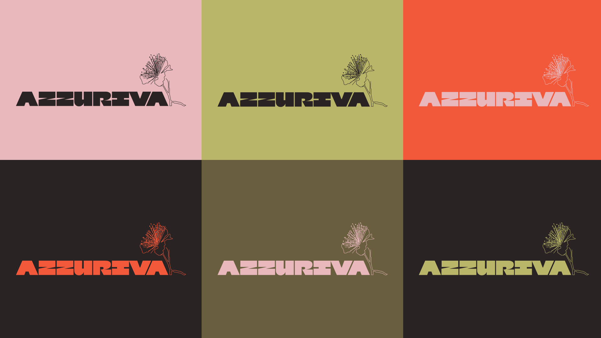
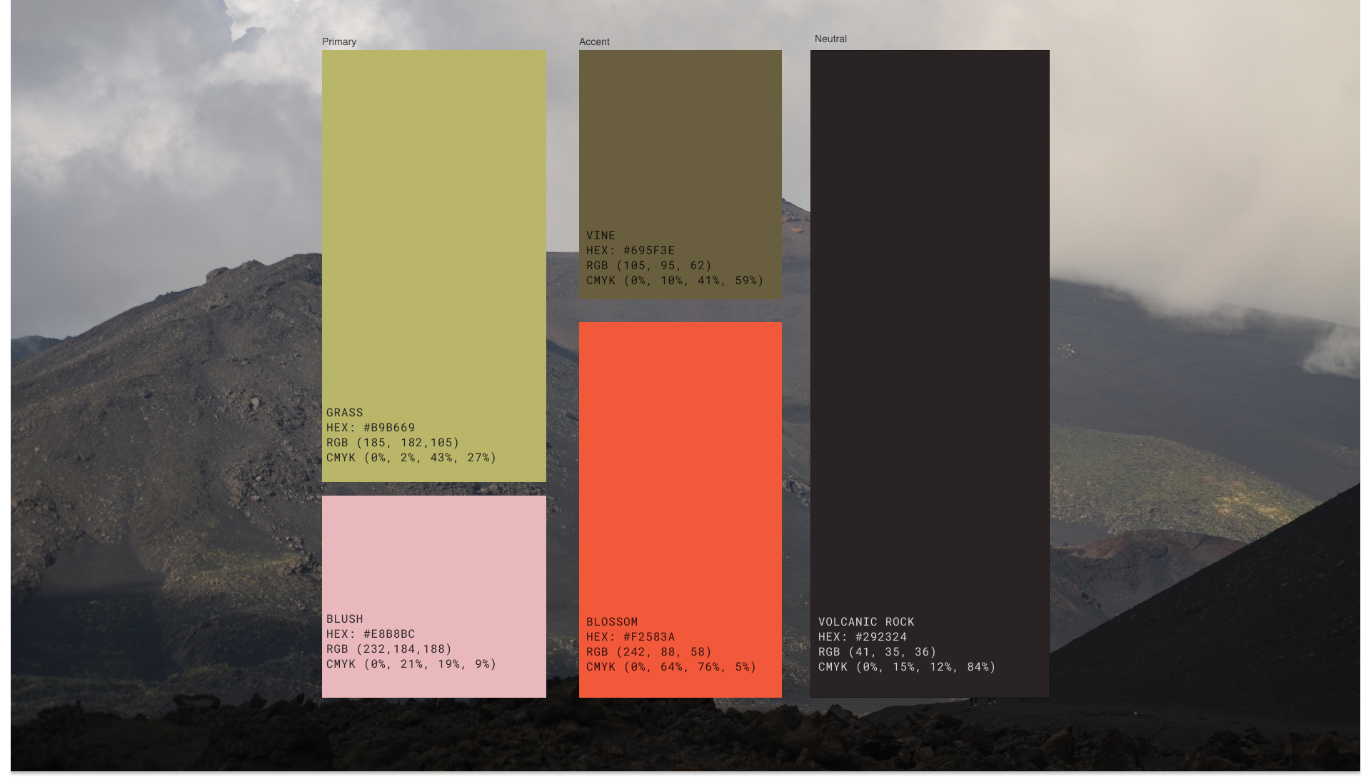
The logo blends bold, modern typography with hand-drawn natural elements, featuring the caper flower—native to Sicily—as a personal connection to the land. The color palette draws from the vineyard’s homeland, echoing its rolling hills, blossoming flowers, and volcanic rock.
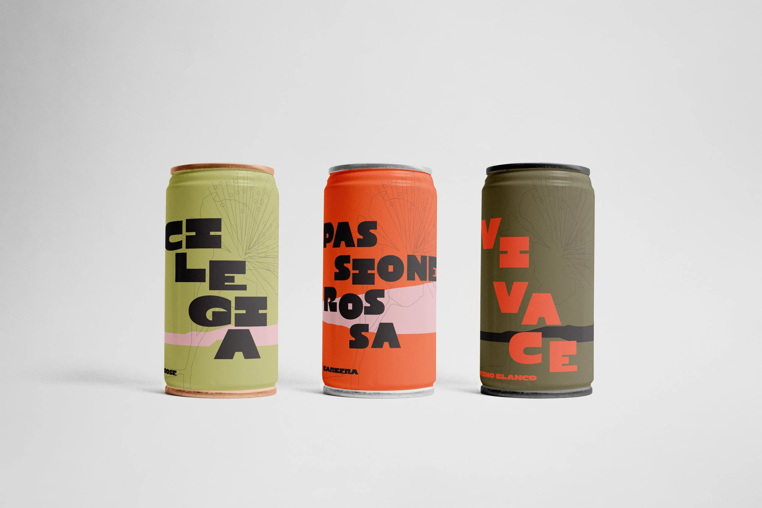
We created a canned option with the intention to break into a more accessible market. Type follows the landscape motif, moving downward like the vineyards hills. This motif, combined with the bold type and color scheme creates a dynamic design. One that stands out over all competitors on the shelf.
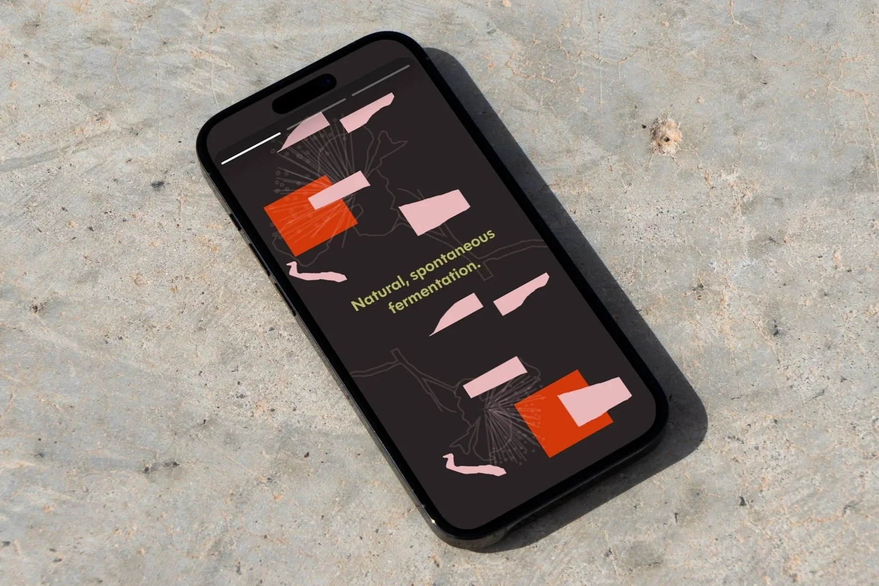
A social that speaks to the wine itself, putting flavor and effervescence into imagery.
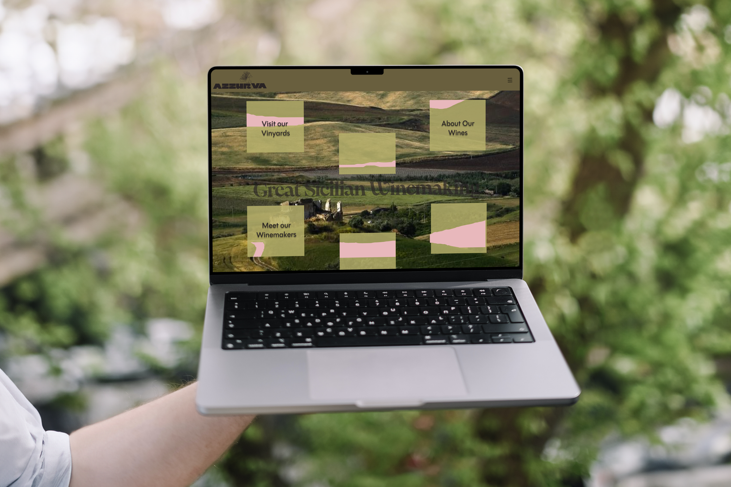
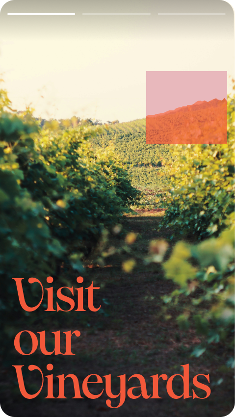
The homepage is the culmination of Azzuriva’s design story—a complete landscape, here you see the map where every detail has emerged from.